
NÖZ
We honor the beauty of the nose.
Global Tech Experience
NOZ is an eco-friendly sunscreen brand focused on protecting both skin and the environment—especially coral reefs. This project involved designing a visually engaging and conversion-focused e-commerce experience that aligns with a specific target persona.
The Challenge
The goal was to create a brand and website that:
Appeals to a fashion-forward, expressive customer
Communicates sustainability clearly
Balances fun aesthetics with functional UX
Encourages conversions through thoughtful design
Target Audience
I designed for “Frances the Fashionista,” a persona very different from myself to push creative boundaries.
Loves bold self-expression through fashion
Values eco-conscious brands
Drawn to visually unique, colorful products
Interested in sustainability but still style-driven
Because NOZ emphasizes reef-safe and eco-friendly messaging, it strongly aligns with her values and lifestyle.
Value Proposition
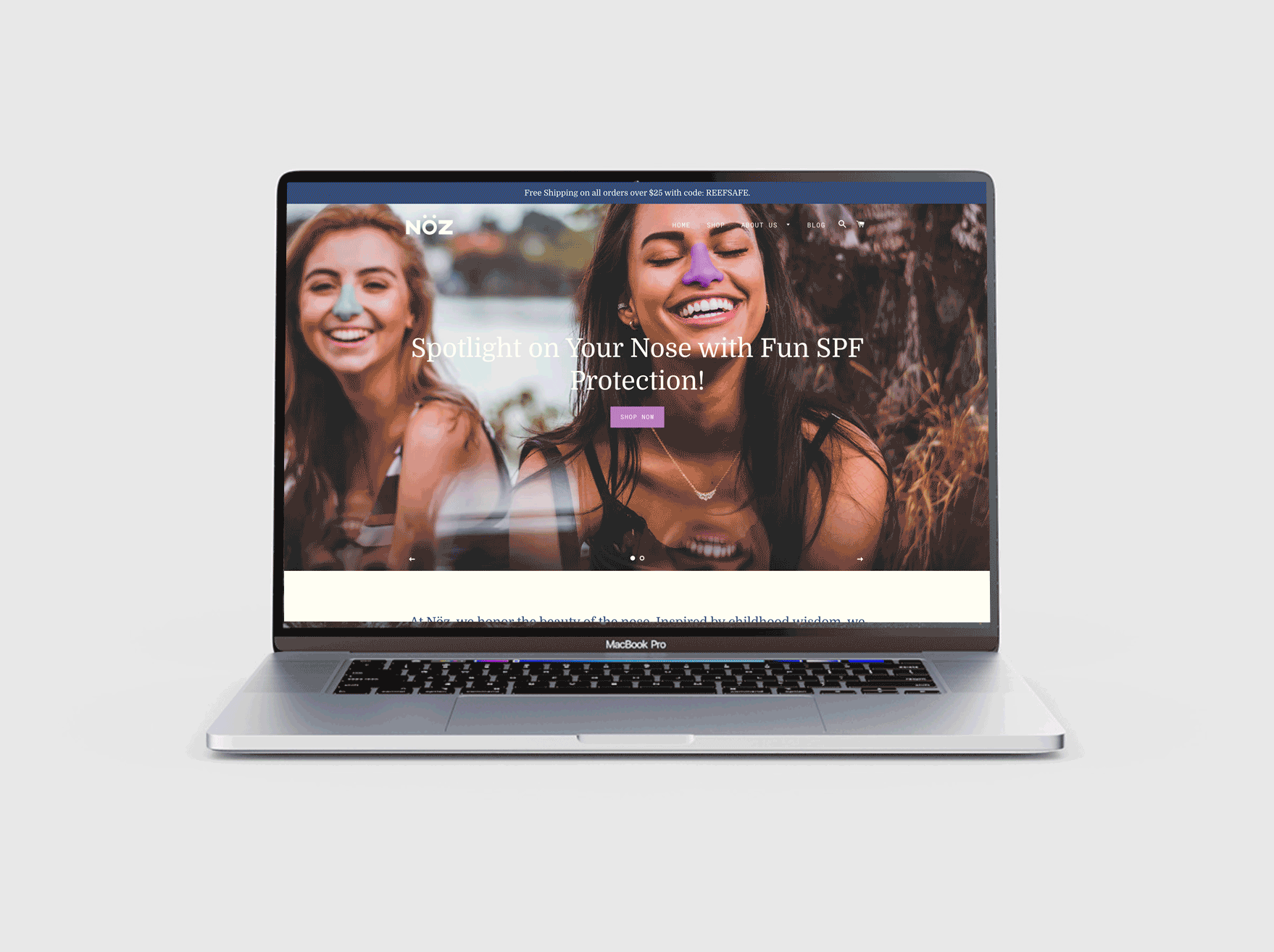
“Give your nose the spotlight it deserves—fun, stylish SPF that protects you and the planet.”
The messaging focuses on:
Making SPF fun and expressive
Highlighting sustainability (reef-safe)
Standing out from traditional sunscreen brands
Strategically, value propositions were placed in high-visibility areas to ensure users couldn’t miss them.
Branding & Visual Identity
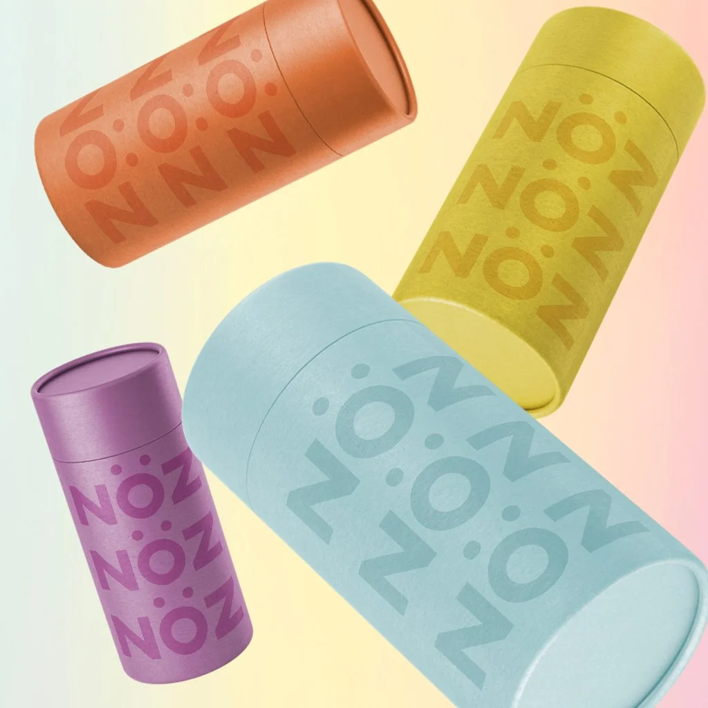
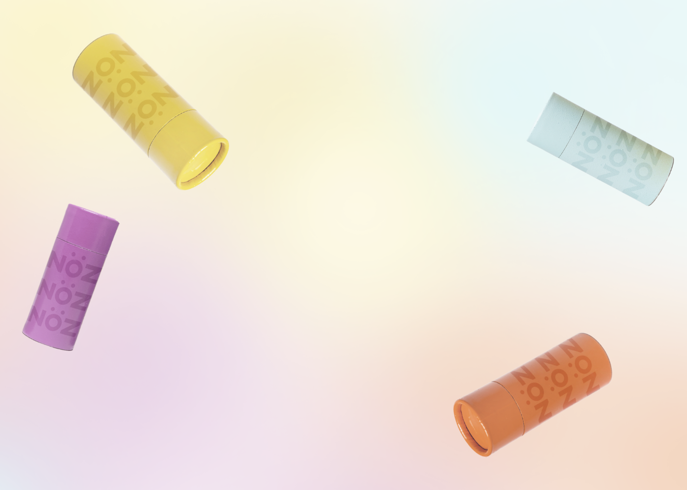
Color Strategy
The palette was built around:
Soft pastels (inspired by Sanrio aesthetics)
Pops of deeper colors for emphasis
A welcoming, playful feel
This aligns with the persona’s love of color and self-expression, helping products stand out.
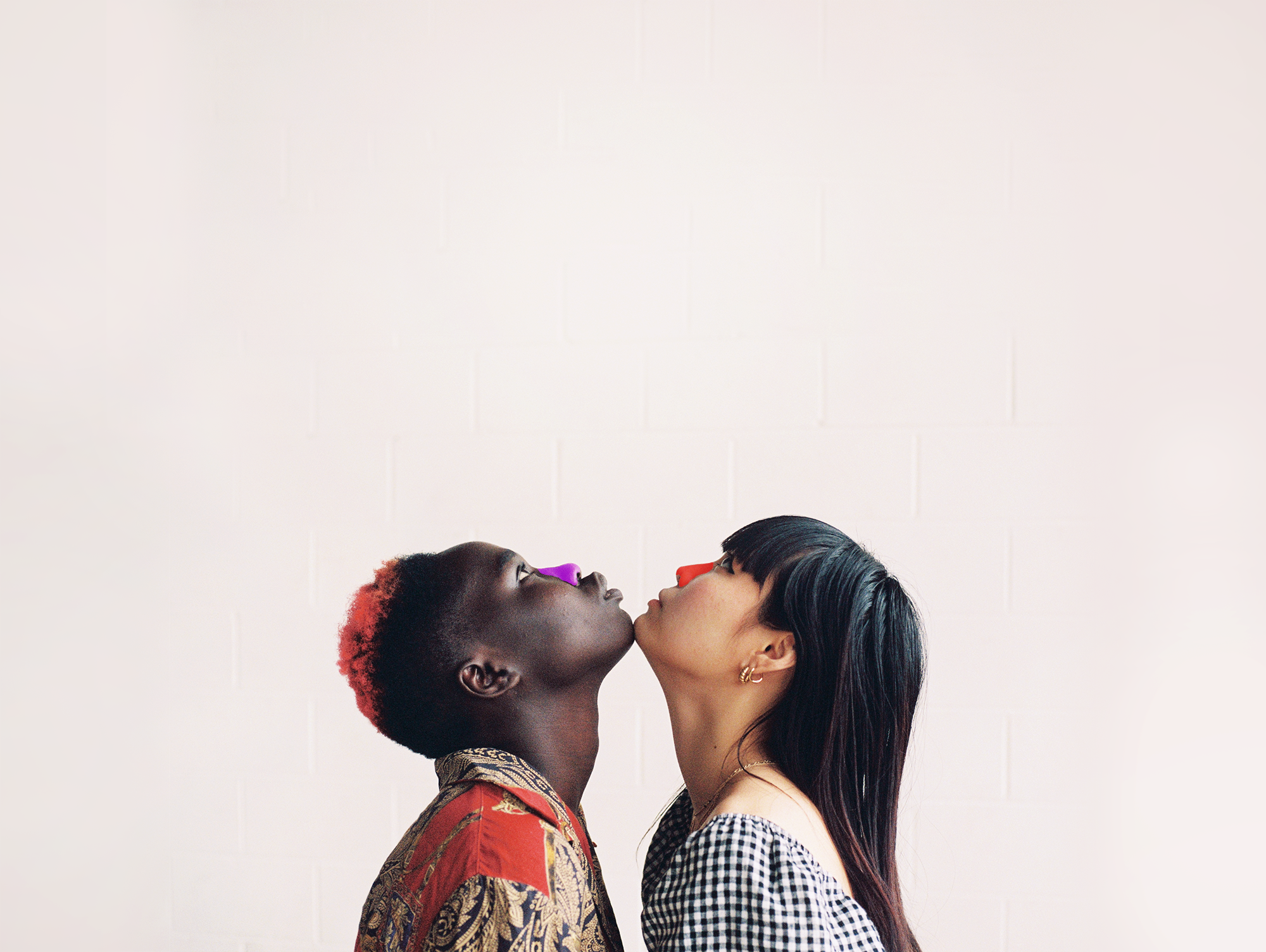
Photography Direction
Imagery focuses on:
Candid, fun, social moments
Bright, youthful energy
Lifestyle-driven storytelling
The goal was to immediately communicate that the brand is fun, expressive, and social, not clinical or boring.
Interaction & Conversion Design
The interface includes key elements to guide user behavior:
CTA Buttons: Clearly visible and emphasized with contrast
Directional Cues: Eye gaze in hero image leads users to CTA
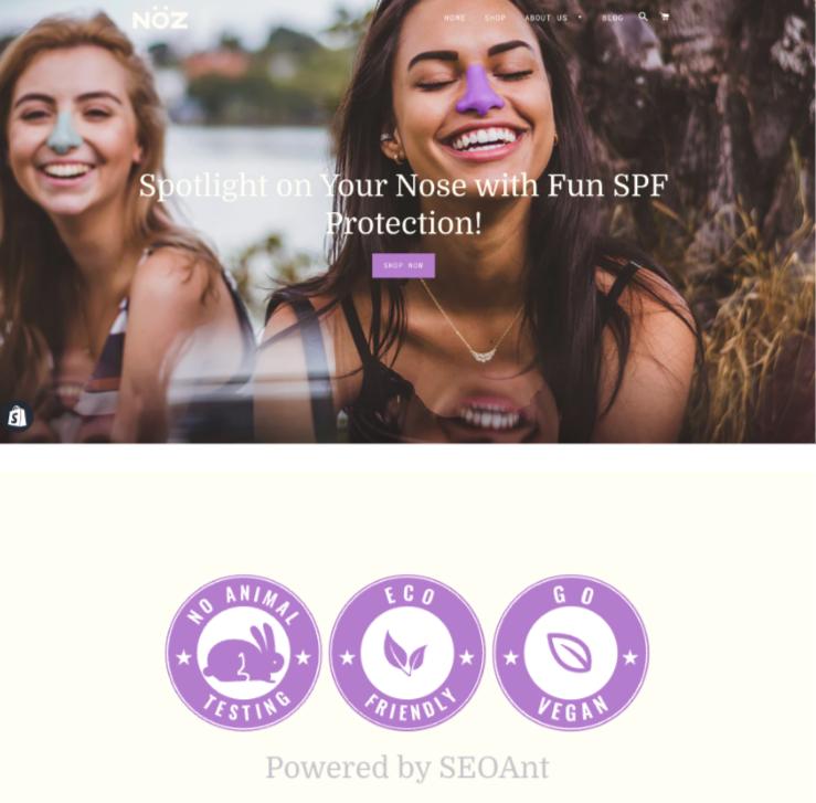
Trust Indicators: Badges placed near key actions
Landing Page Optimization
Clear visual hierarchy from headline → product → CTA
Minimal clutter for easier scanning
Strategic placement of key elements to support user flow
Results / Key Takeaways
Created a cohesive interface that balances aesthetics and usability
Used visual hierarchy and contrast to guide user actions
Designed with a specific user in mind to improve clarity and focus
Applied UX principles to support conversion and usability
What I’d Improve
Conduct usability testing to validate design decisions
Optimize for mobile experience
Test different CTA placements and styles
Refine accessibility (color contrast, readability)