
Project Overview
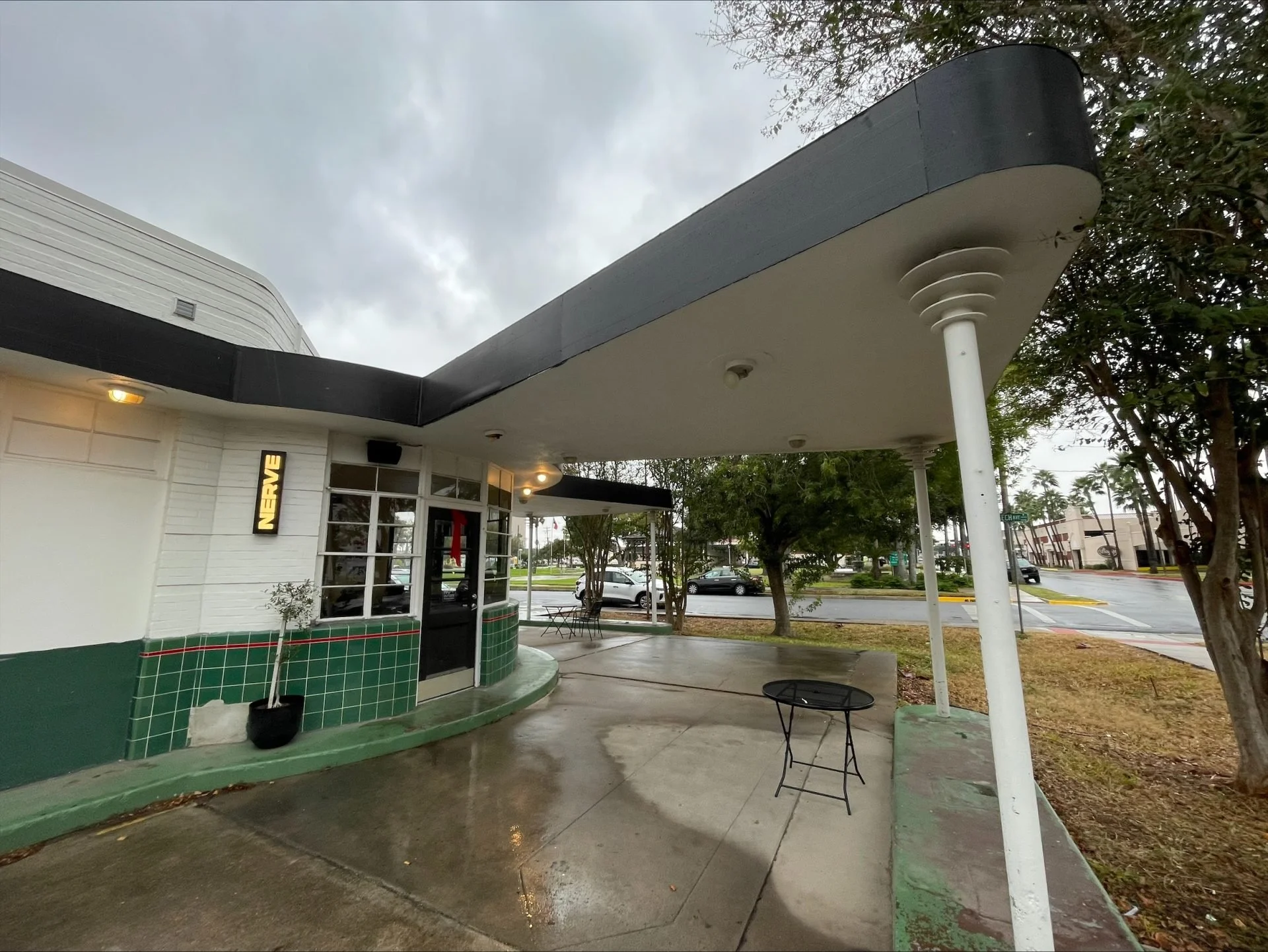
Nerve is a local coffee shop website that needed improved usability and structure. This project focused on identifying key usability issues and redesigning core user flows to create a more intuitive and engaging digital experience.
The Challenge
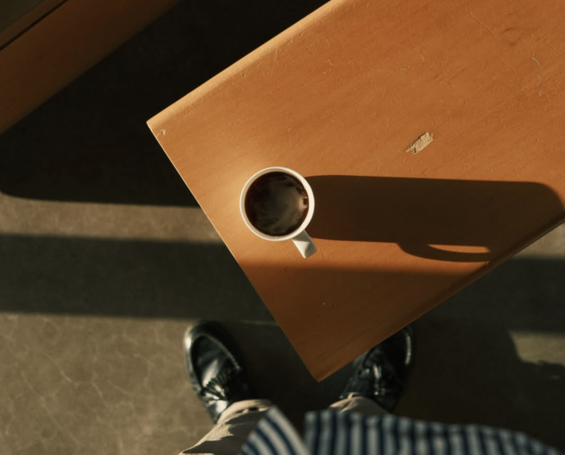
The existing website lacked clear structure and usability, making it difficult for users to:
Find essential information (hours, location, menu, events)
Navigate efficiently, especially on mobile
Complete basic tasks without confusion
The challenge was to improve usability while maintaining the brand’s creative and community-driven identity.
TARGET AUDIENCE
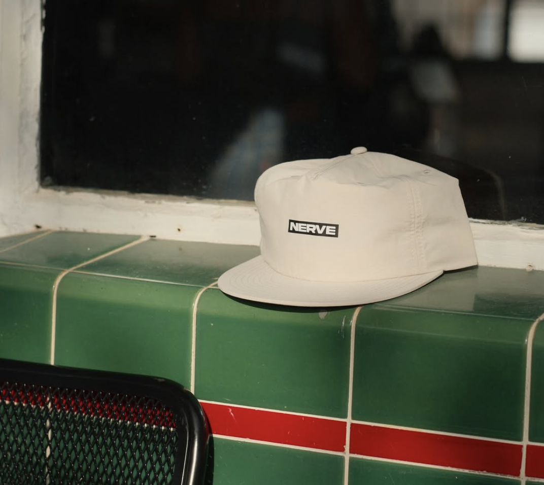
The experience was designed for:
Young adults and college students
Coffee lovers and creatives
Users looking for a place to study, work, or socialize
This audience prefers:
Clean, intuitive interfaces
Mobile-first design
Visually engaging, authentic experiences
VALUE PROPOSITION
The experience was designed for:
Young adults and college students
Coffee lovers and creatives
Users looking for a place to study, work, or socialize
This audience prefers:
Clean, intuitive interfaces
Mobile-first design
Visually engaging, authentic experiences
UI DESIGN & VISUAL SYSTEM
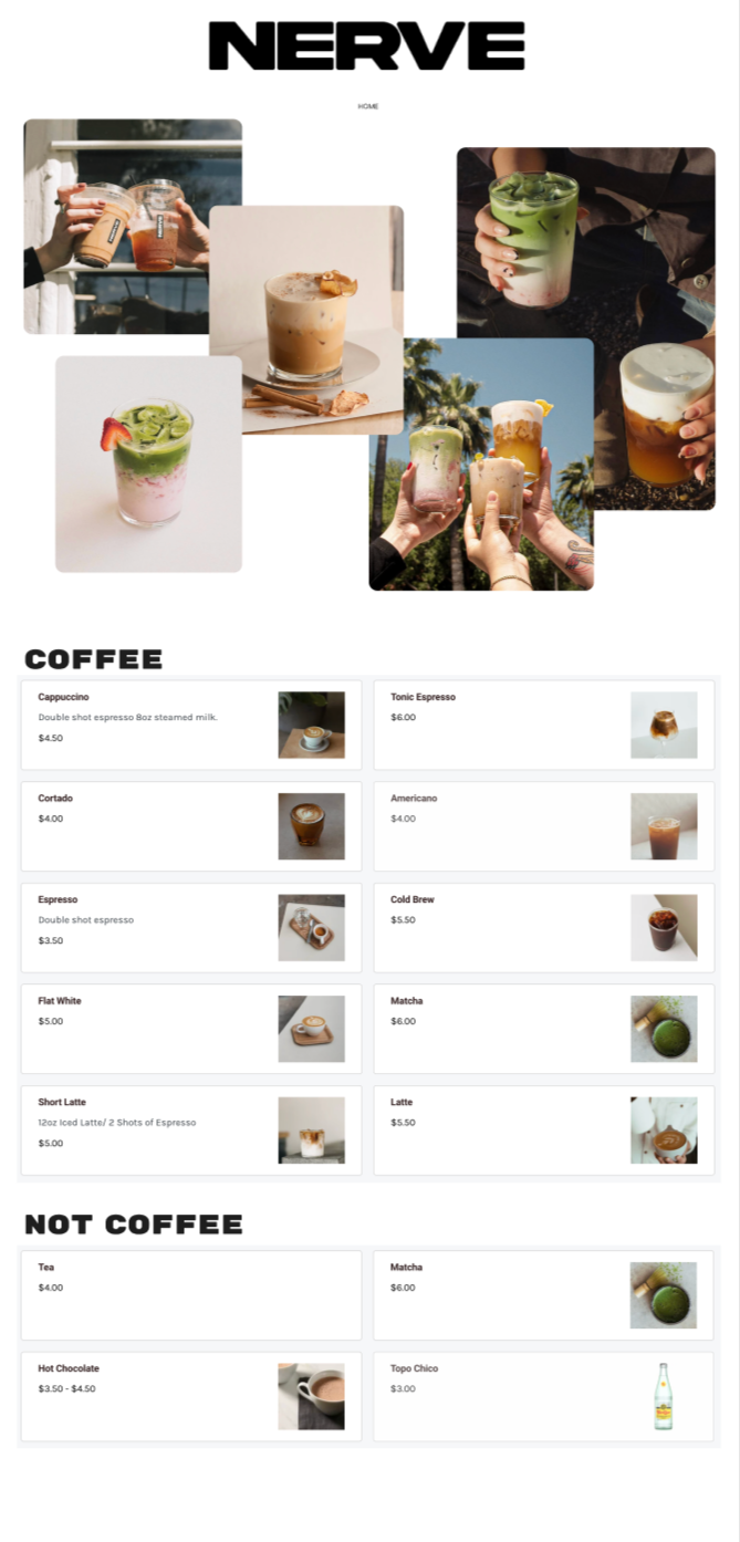
Color & Hierarchy
Warm neutral palette (browns, creams, sage tones)
Clear contrast to improve readability
Consistent typography to guide scanning
Imagery & Layout
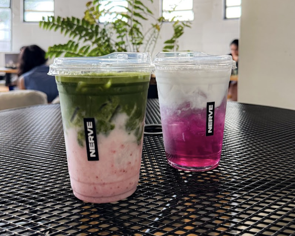
Visual emphasis on the physical space, drinks, and events
Clean, structured layout to reduce clutter
Content organized to prioritize key user needs first
Interaction & Conversion Design

Key improvements were designed to support usability:
Simplified navigation for faster access to key pages
Clear presentation of hours, location, and menu
Improved mobile layout for smoother interaction
Streamlined flows for common tasks (e.g., checking hours or events)
Landing Page Optimization
Prioritized essential information above the fold
Improved content hierarchy for easier scanning
Reduced friction in key user journeys
Results / Key Takeaways & What I’d Improve

Identified major usability issues through testing
Improved task completion and reduced user confusion
Created a more intuitive and mobile-friendly experience
Balanced aesthetic design with functional usability
Conduct additional rounds of usability testing
Expand redesign to more pages and flows
Refine accessibility (contrast, readability, responsiveness)
Validate design decisions with more user data