

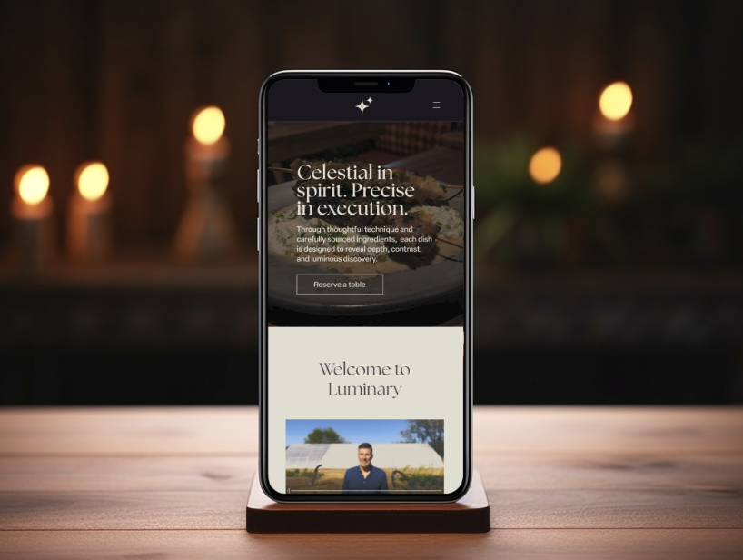
Luminary is a fine dining restaurant concept with Michelin-star ambitions. This project focused on designing a refined, story-driven digital experience that communicates luxury while remaining approachable and easy to navigate.
The Challenge
The goal was to design a website that:
Feels elevated but not intimidating
Clearly communicates the dining experience
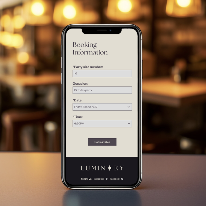
Guides users toward making a reservation
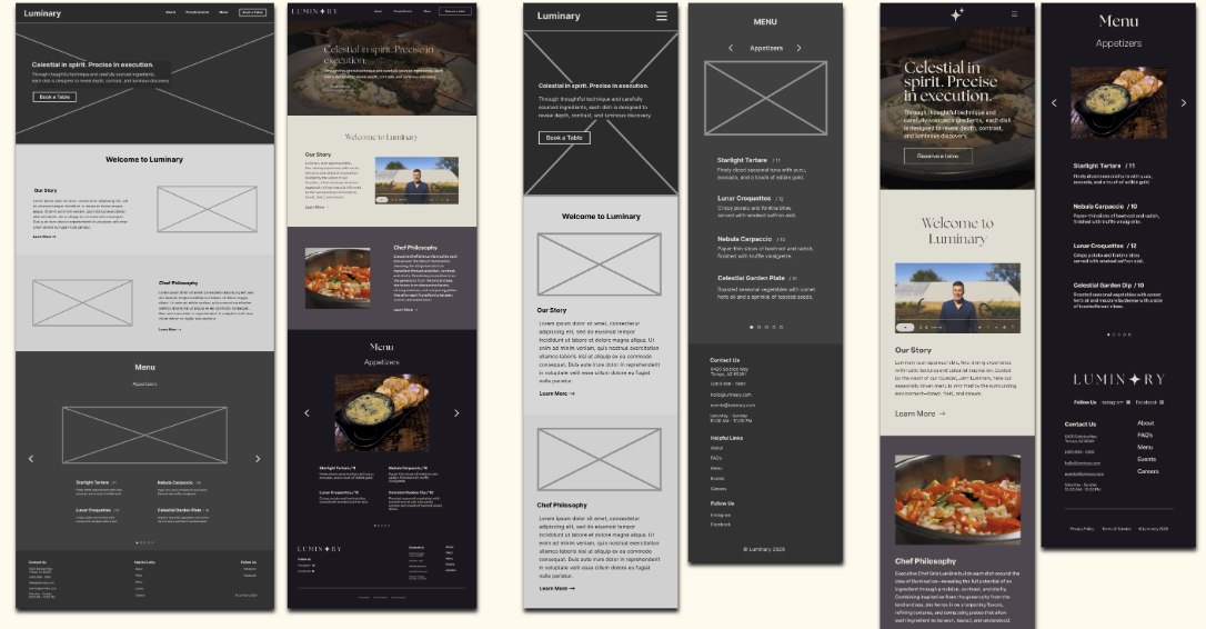
Works seamlessly across mobile and desktop
The challenge was balancing luxury aesthetics with usability to ensure first-time users don’t feel overwhelmed.
-
The experience was designed for users who:
Are interested in high-end dining experiences
May be new to fine dining and need guidance
Are planning special occasions or events
This required an interface that builds confidence while maintaining a premium feel.
-
The interface communicates value through:
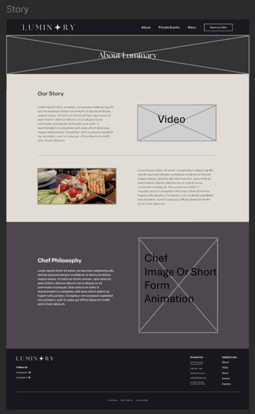
A story-driven layout that introduces the brand experience
Clear pathways to key actions like reservations
Structured content that balances storytelling with usability
-
Color & Hierarchy
Dark, elegant color palette to reflect a luxury brand
High contrast between text and background for readability
Strategic use of spacing (“breathing room”) to reduce visual clutter.
Imagery & Layout
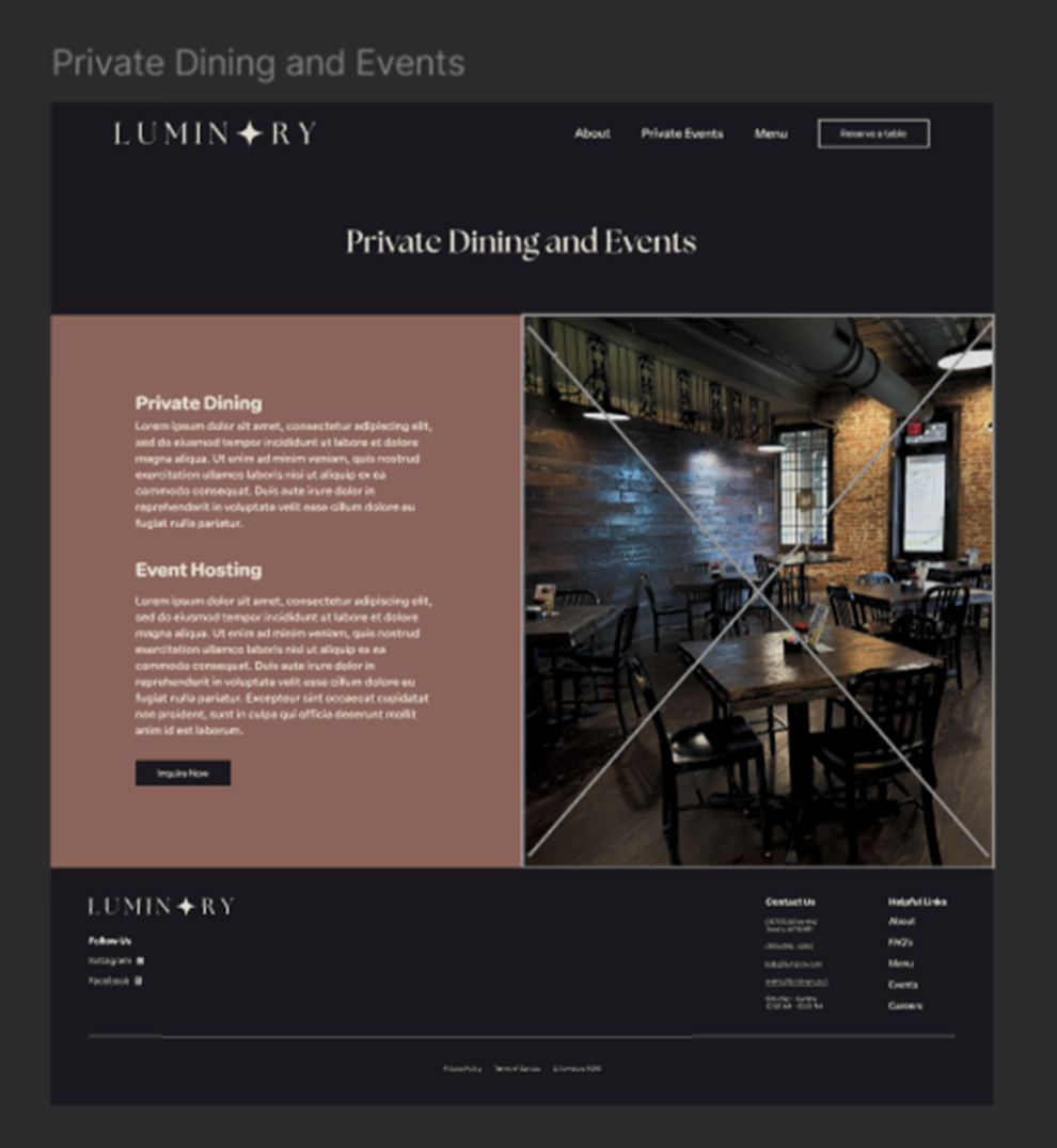
Large, immersive imagery to showcase the dining experience
Story-first layout guiding users through the brand narrative
Content structured to move from discovery → exploration → reservation
-
Key elements designed to guide user behavior:
Reservation CTA: Clearly visible throughout the experience
Navigation Structure: Simplified to improve discoverability
Micro-interactions & transitions: Enhance flow without distraction
The experience was designed to naturally lead users toward booking a reservation.
-
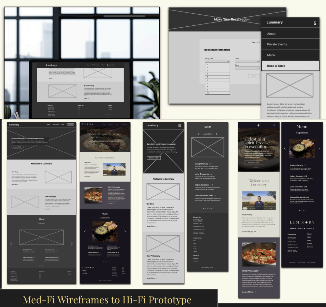
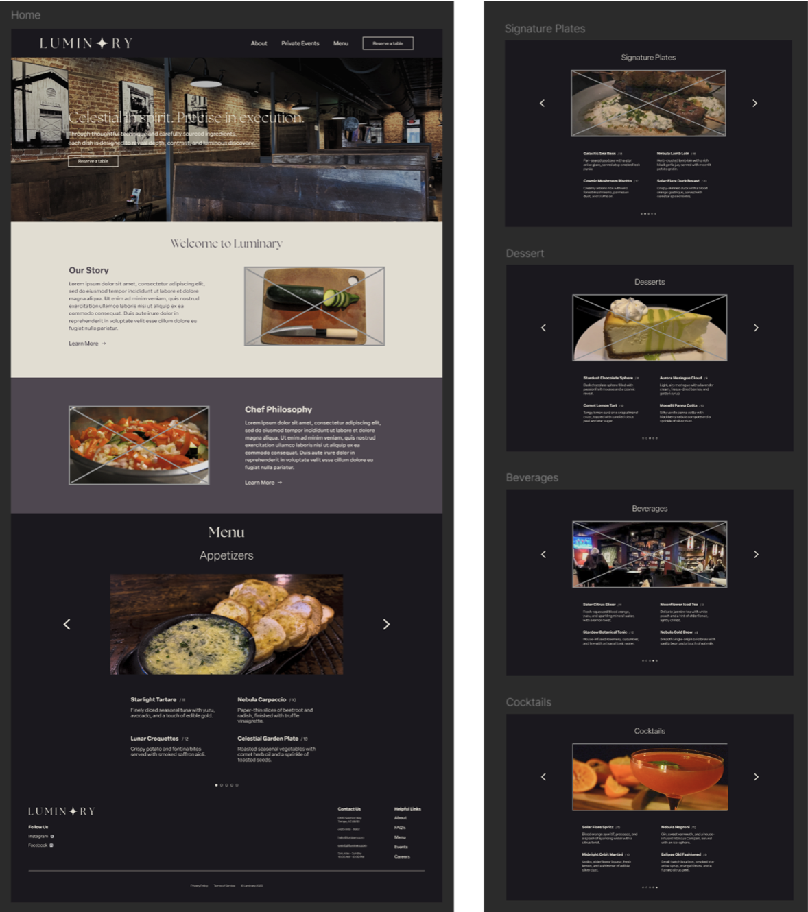
Clear visual flow from introduction → menu preview → reservation
Consistent layout across pages (Home, Story, Menu, Reservation, Events)
Reduced friction in the reservation process
The Process
Results / Key Takeaways
Strong reservation flow with high task success
Clear navigation improved content discoverability
Balanced storytelling with usability for a better user experience
Created a cohesive, responsive design across devices
What I’d Improve
Further refine mobile interactions and responsiveness
Simplify certain flows based on user testing feedback
Continue testing storytelling vs. speed of access to key actions
Improve clarity in early-stage navigation for first-time users